



- 5 stars: 105 (86%)
- 4 stars: 10 (8%)
- 3 stars: 2 (2%)
- 2 stars: 1 (1%)
- 1 star: 4 (3%)
I like how simple the scene is.
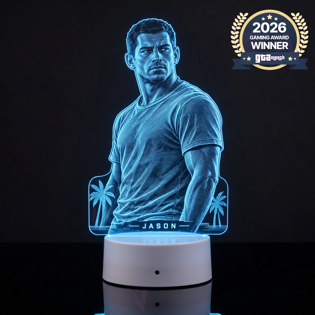
The blue is easy to build a setup around.
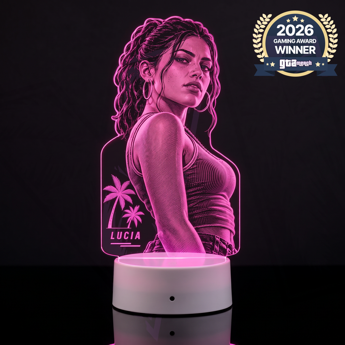
This one is pure Vice City vibes.
Such a cool piece for a Lucia-themed setup.
The design has me excited for GTA 6 again.
Definitely gives the desk some personality.
This version does not do much for me visually.
The character idea is fine, but this color does not really suit my room.
This feels like a fun upgrade from plain RGB.
I put Jason on the shelf above my desk.
GTA 6 vibes as soon as I look at it.
Lucia doesn't suit my desk as well as I hoped. I prefer scenery.
I went with Jason for my setup.
That character outline is such a good idea.
The Jason design is my favorite of the three.
I like Jason, but the character lamp doesn't suit my desk.
The Jason design is cool. I normally choose purple instead of blue.
Really into the pink on this one.
This looks great beside a black PC.
Really like this take on a GTA 6 light.
This looks good next to my PS5.
I put this right beside my monitor.
Nice way to bring Jason into the setup.
The pink character light is too much for the understated setup I want.
I paired this with subtle pink desk lighting.
The palms look cool, though I prefer a simpler skyline.
Great Vice City mood. I wish it had a little more blue.
That beach-city feeling is exactly what I like about it.
I built the desk colors around this.
Pink lighting and GTA is a great combo.
The city-and-palms combo never gets old.
I have this next to my console.
I keep this on display between gaming sessions.
The silhouette makes this one stand out.
Really happy I went with this one.
The Lucia one is sick.