


vice city vibes for sure
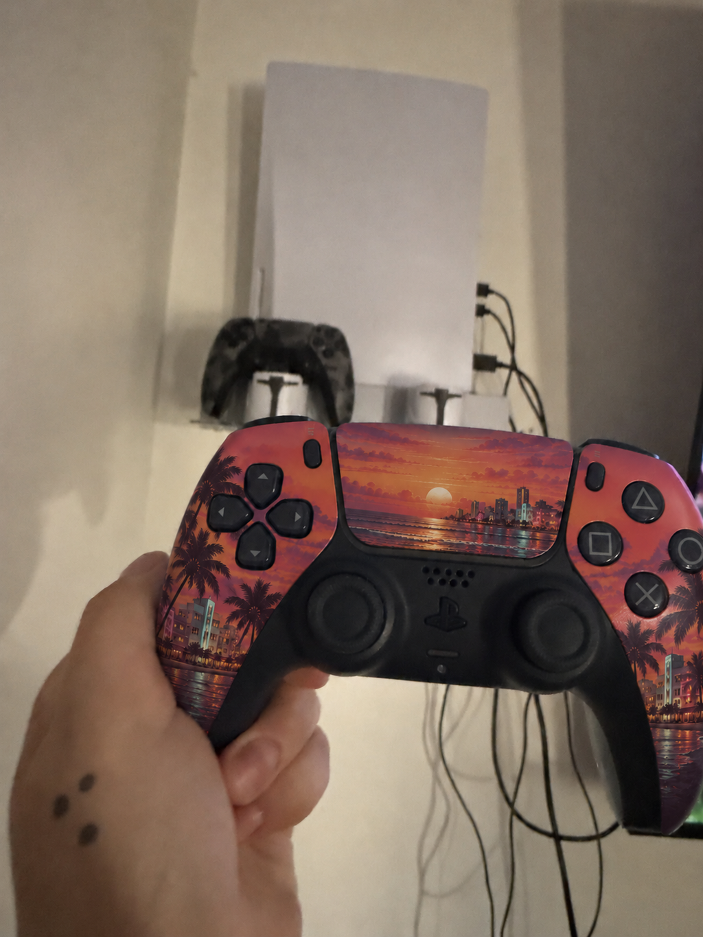
this looks great with my purple lights
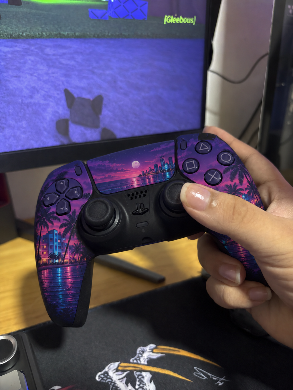
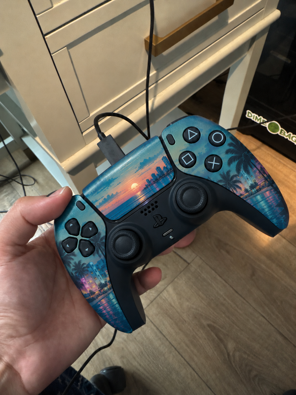
love the ocean colors
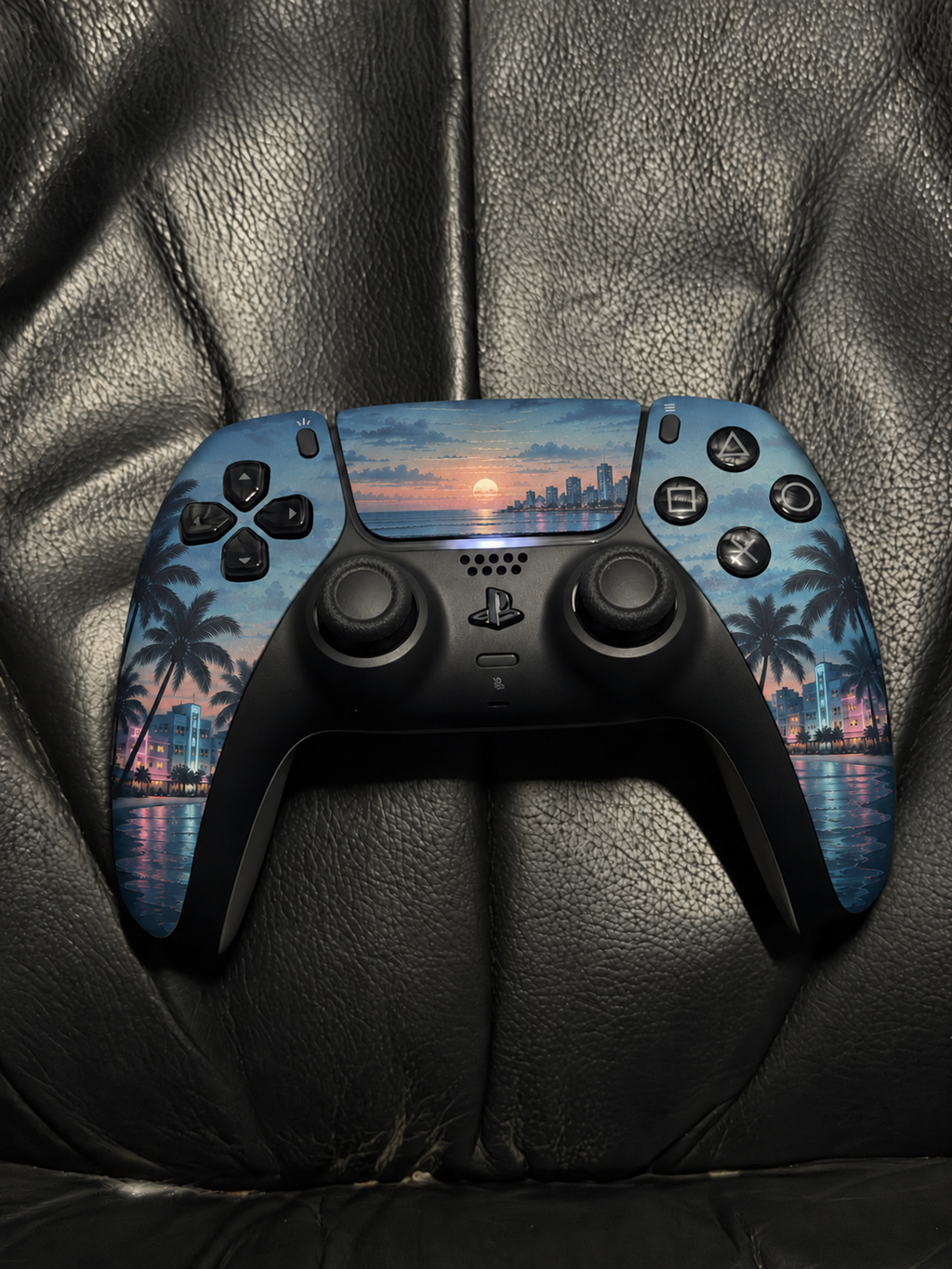
my blue setup feels complete
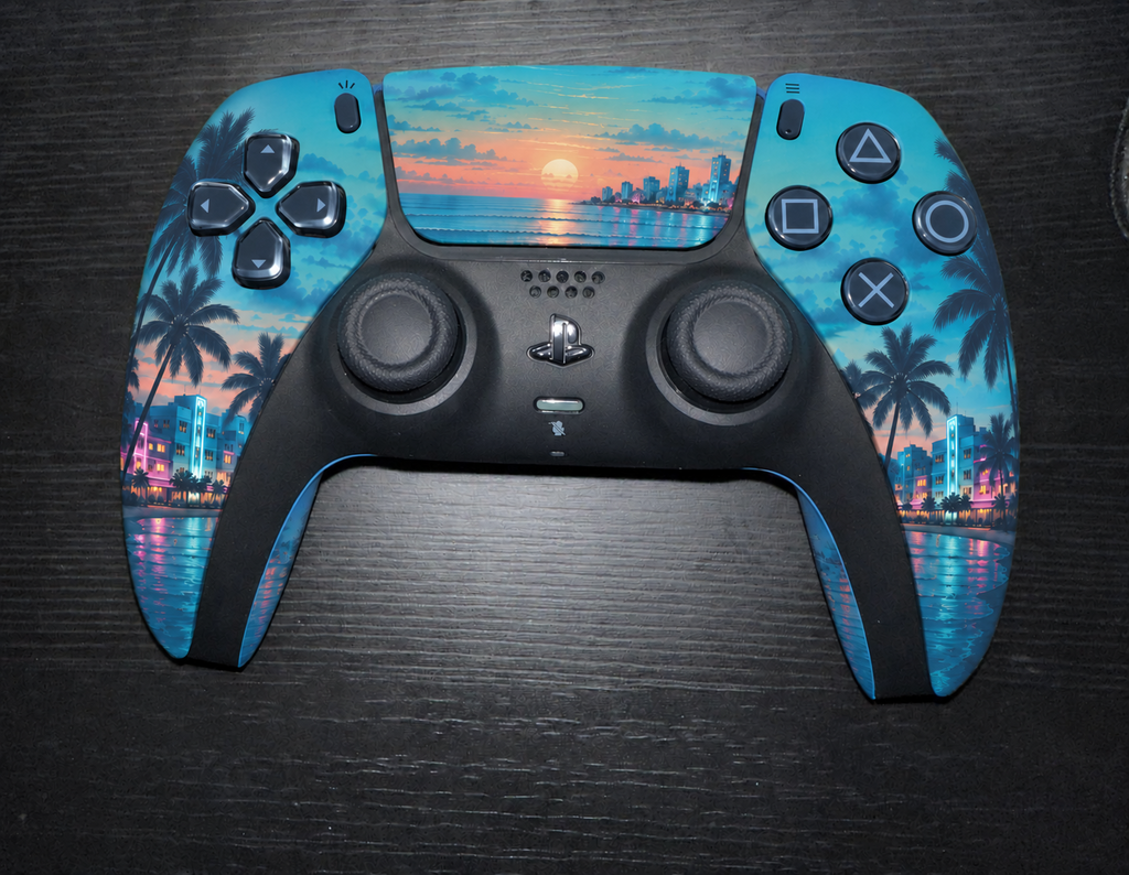
purple night is gorgeous
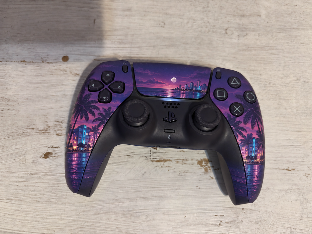
happy with how the sunset looks
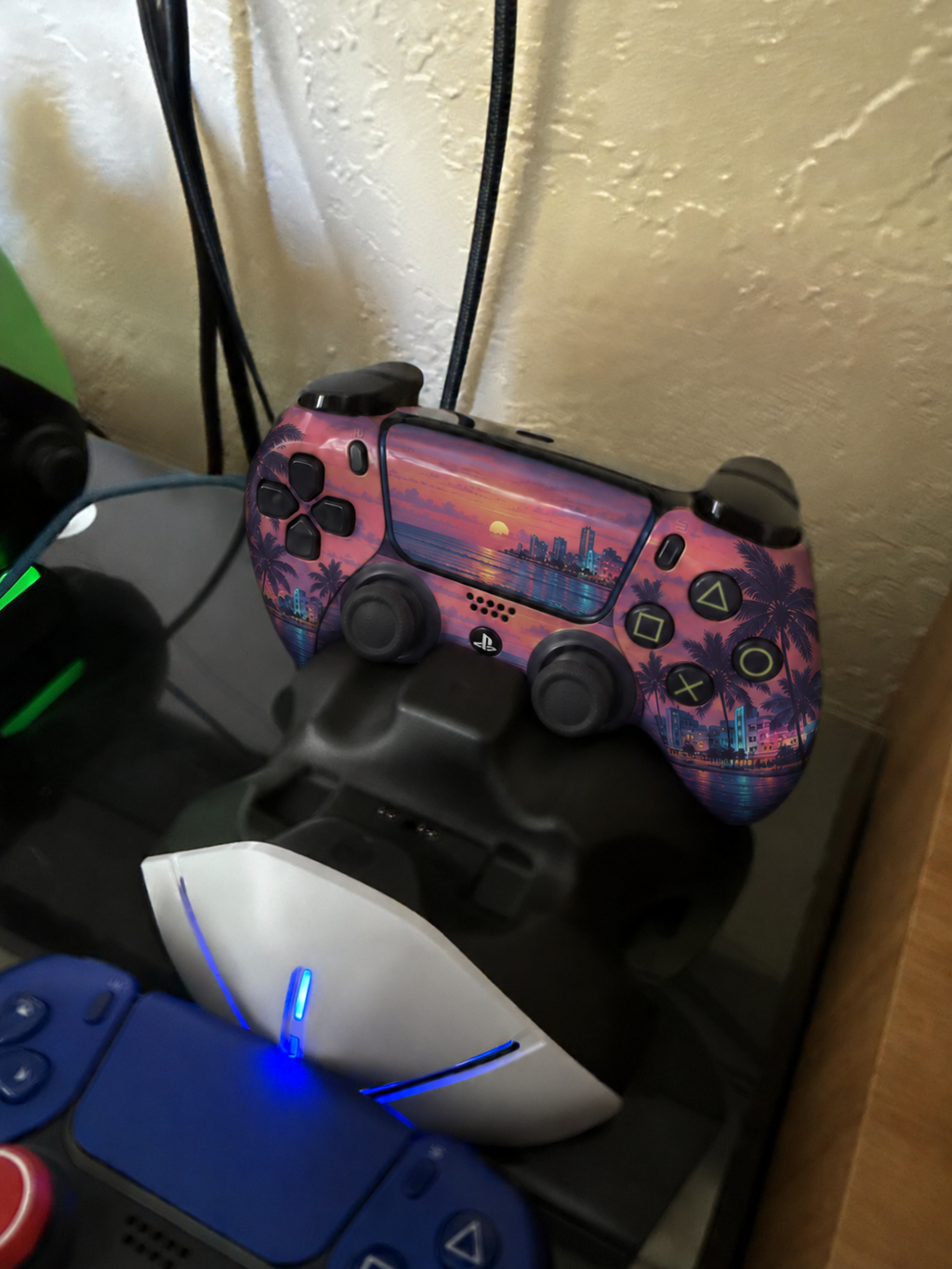
this is fire
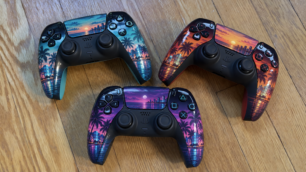
looks clean
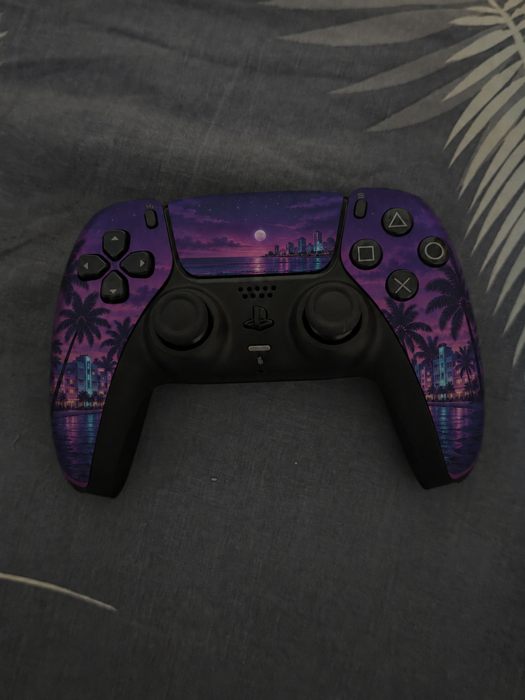
pink dusk is fire
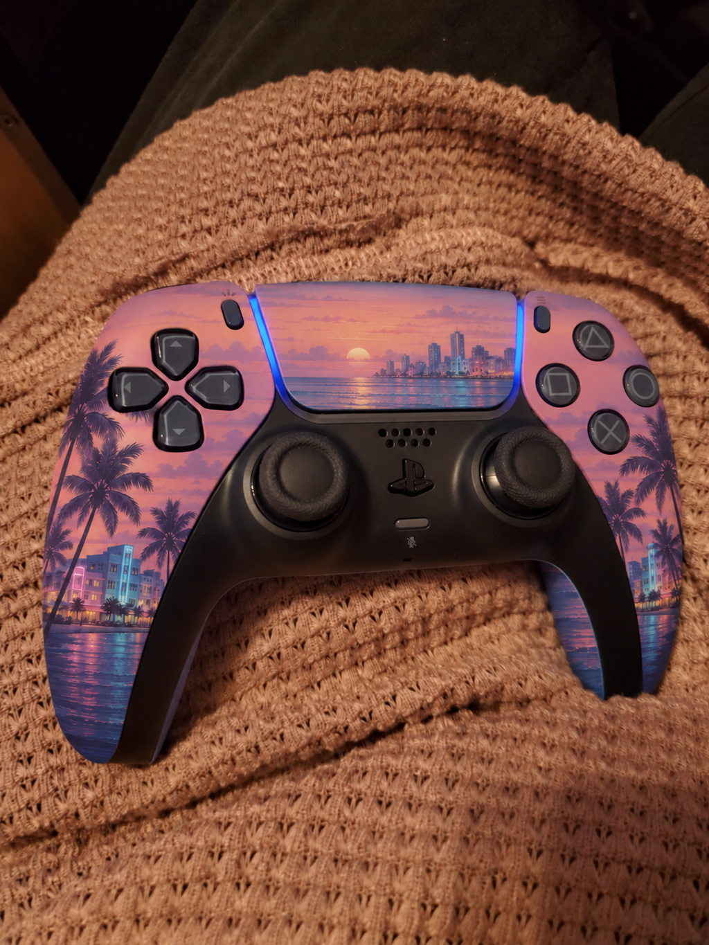
my setup is all purple now
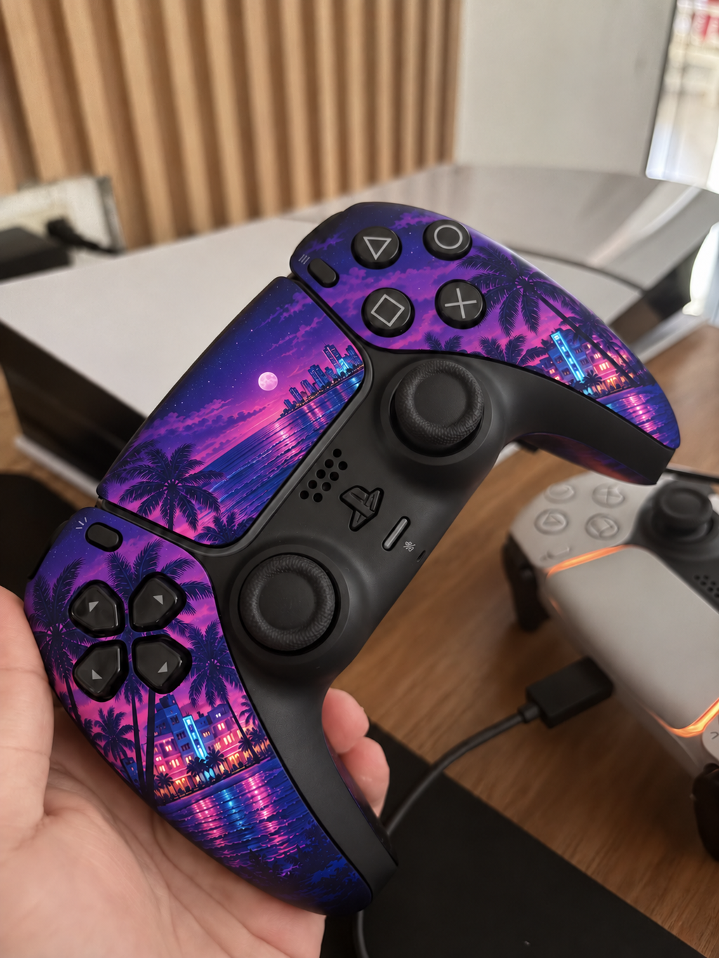
sick design
pink dusk looks so good
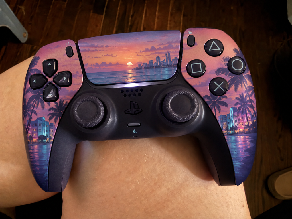
glad I picked this
The ocean imagery works especially well across the curved handles.
The palms are easy to recognize even in the darker areas.
the warm colors look amazing
The sunset across the front has the feel of a miniature landscape painting.
The overall look is strong. A softer cyan on the buildings would make it more balanced for me.
The artwork is pretty, but the pastel pink and dark center feel like two different moods to me.
pink was def the right choice
The water reflections add just enough pink to keep the palette interesting.
The purple and pink feel too saturated for my taste, even though I like the night theme.
The sky has enough cloud detail to make the blue feel layered.
really happy with the teal design
This would be my choice for a blue-lit gaming setup.
def an upgrade for my controller
The small turquoise edge is a great finishing touch visually.
the water design is sick
The cool colors make the controller look too subdued for the lively setup I have in mind.
love how dark this one is
This would fit naturally into a purple-lit desk setup.